ADX ‘Ultimate’ Gaming Rebrand
Identity Design
Creative Direction, Visual Identity, Art Direction, Branding, Packaging Design, Digital/Web, Conceptual.
––
Brief.
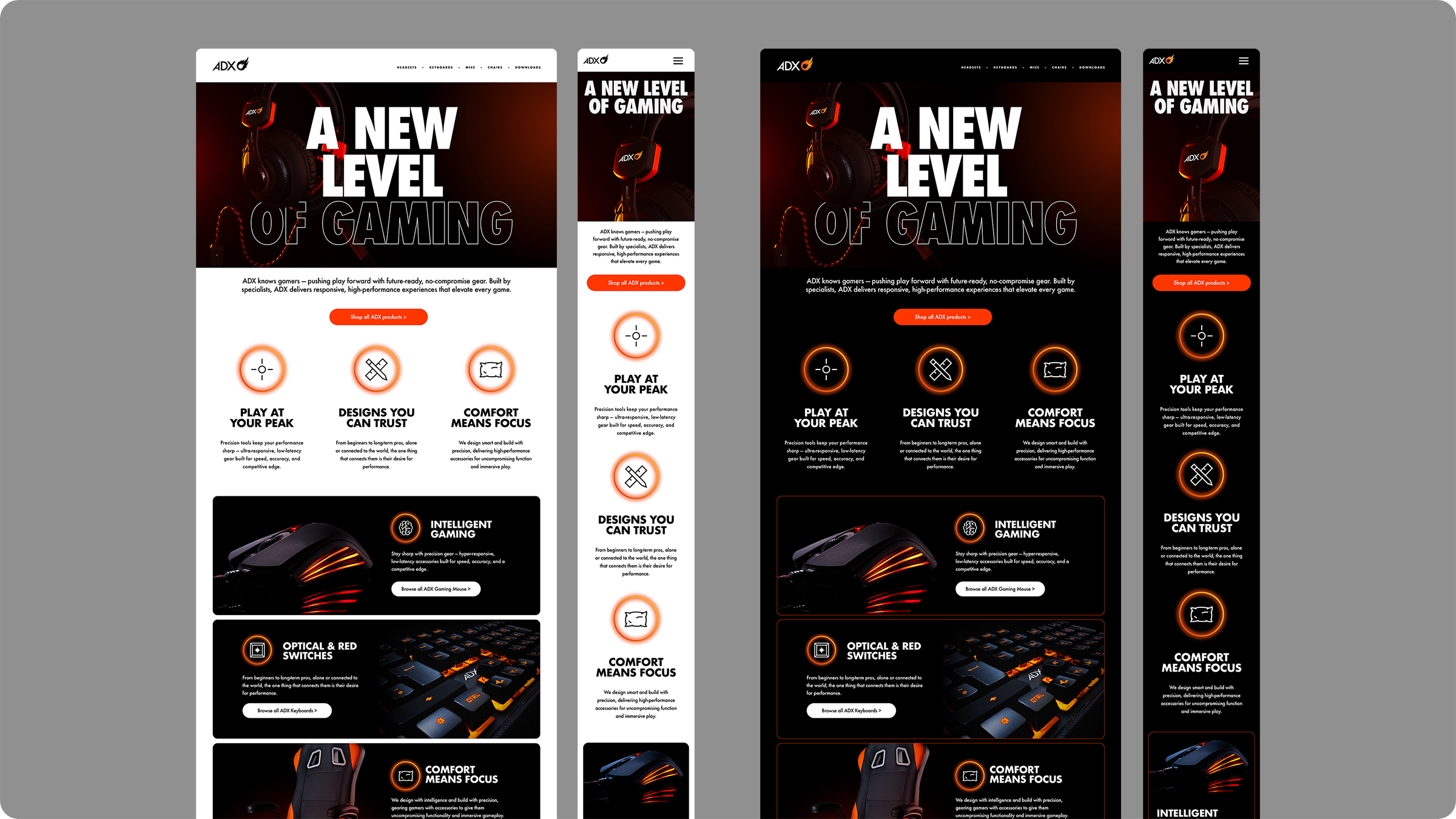
Reimagine Dixon Carphone’s ADX gaming accessories brand by modernising and re-energising the identity to allow ADX to become the gaming accessory brand of choice.
Challenges.
How to work ADX Dark SKU’s on the dark theme background to retain SKU prominence.
How do we retain brand equity while evolving the identity, ensuring ADX remains recognisable and familiar to existing customers?

Creative execution:
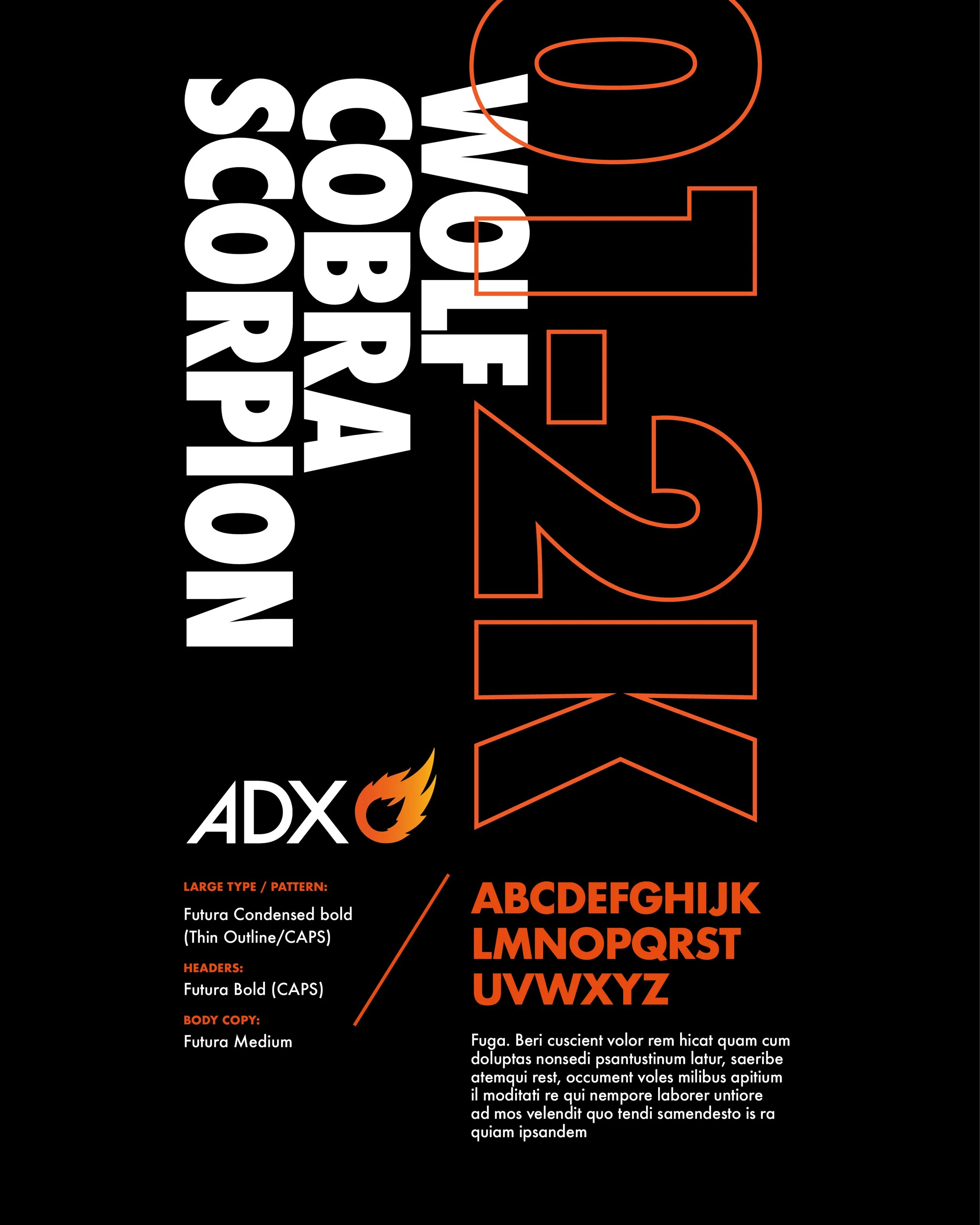
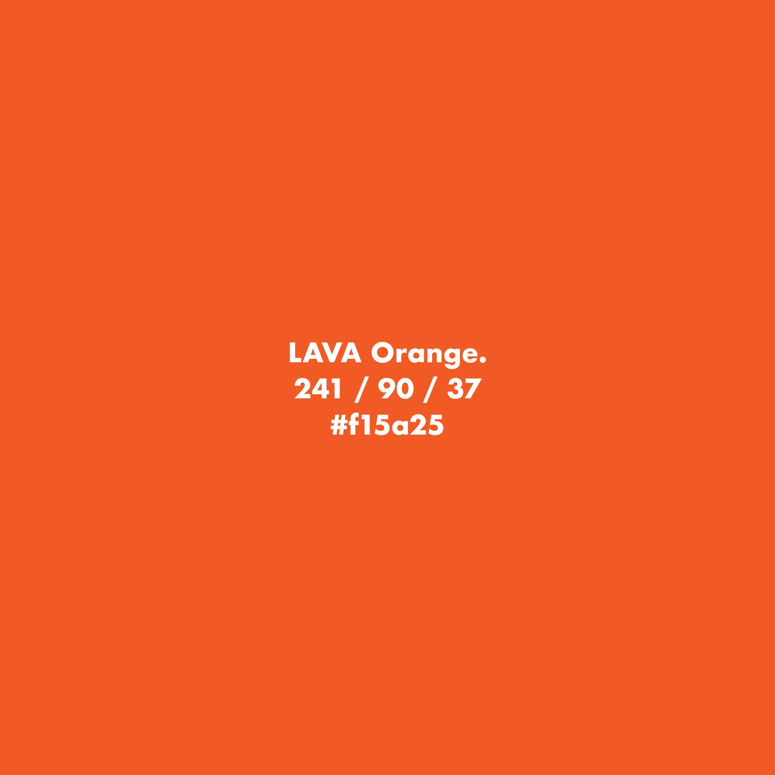
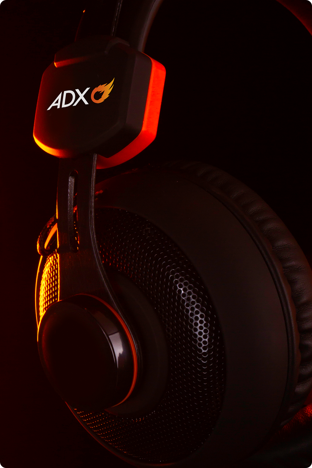
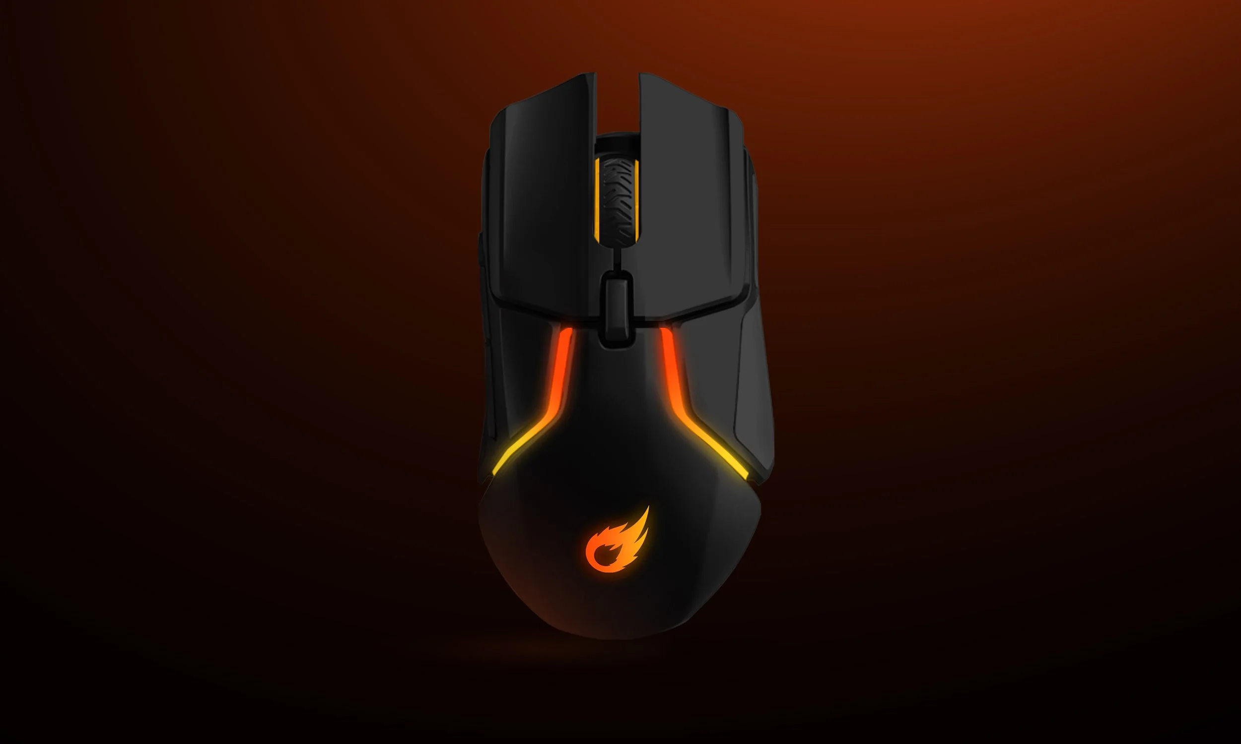
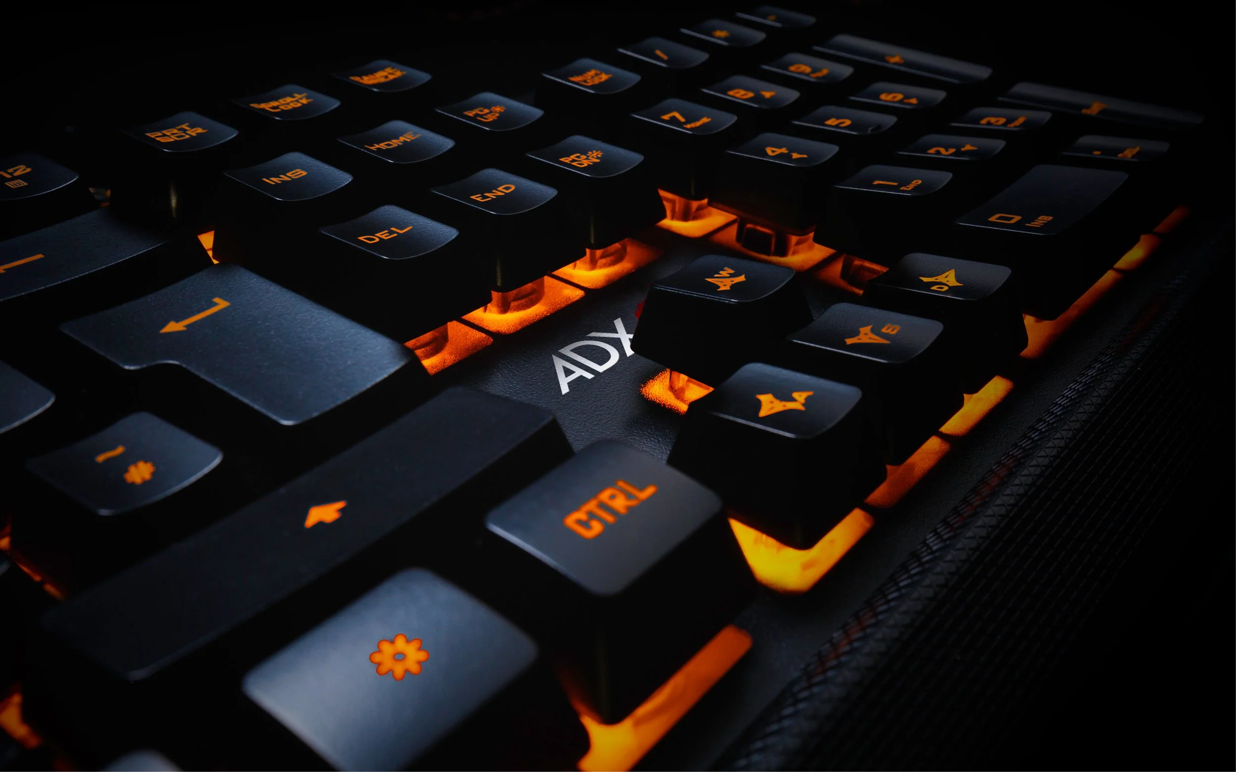
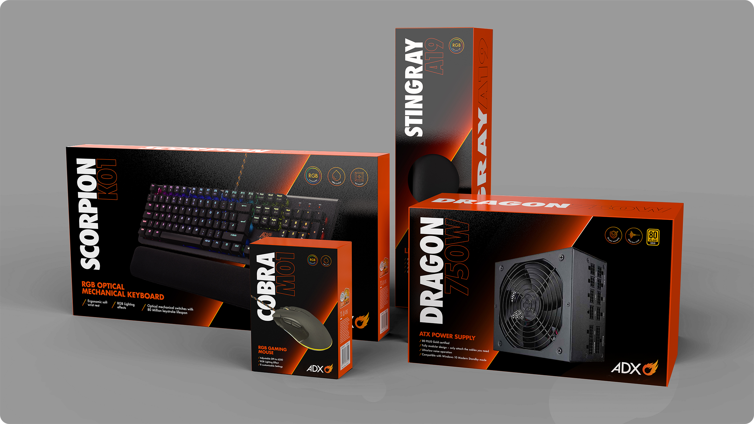
We refreshed the identity by modernising the look and feel while retaining key brand equity. The creative direction reimagined the flame as a more ownable, elevated narrative; translating ‘heat’ through atmospheric product imagery, temperature-led gradients within the logo, and lava-like rings across iconography. For an added layer of distinction and newness, we introduced bold vertical typographic principles and a new typeface that brought disruption and clarity to the packaging — giving the range stronger shelf standout against competitors.
Beyond visibility, the repositioning aimed to align the brand more confidently with its promise of delivering the ultimate gaming experience to new and existing customers, elevating perception, building trust, and ensuring the products feel credible alongside higher-end competitors.
-
![]()
Revised ADX Packaging Design Concept
-
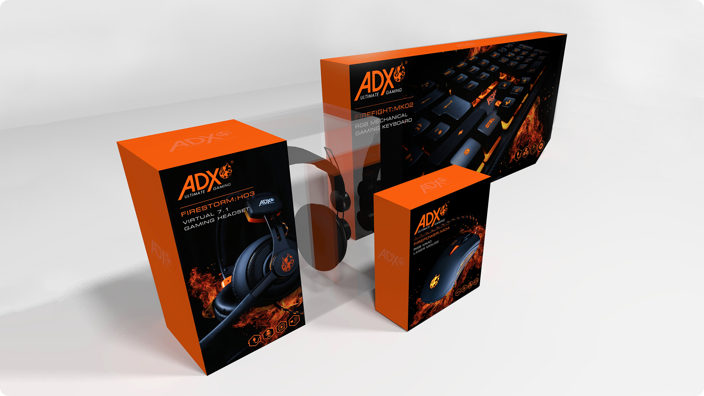
![]()
Previous ADX Gaming Packaging Design
-
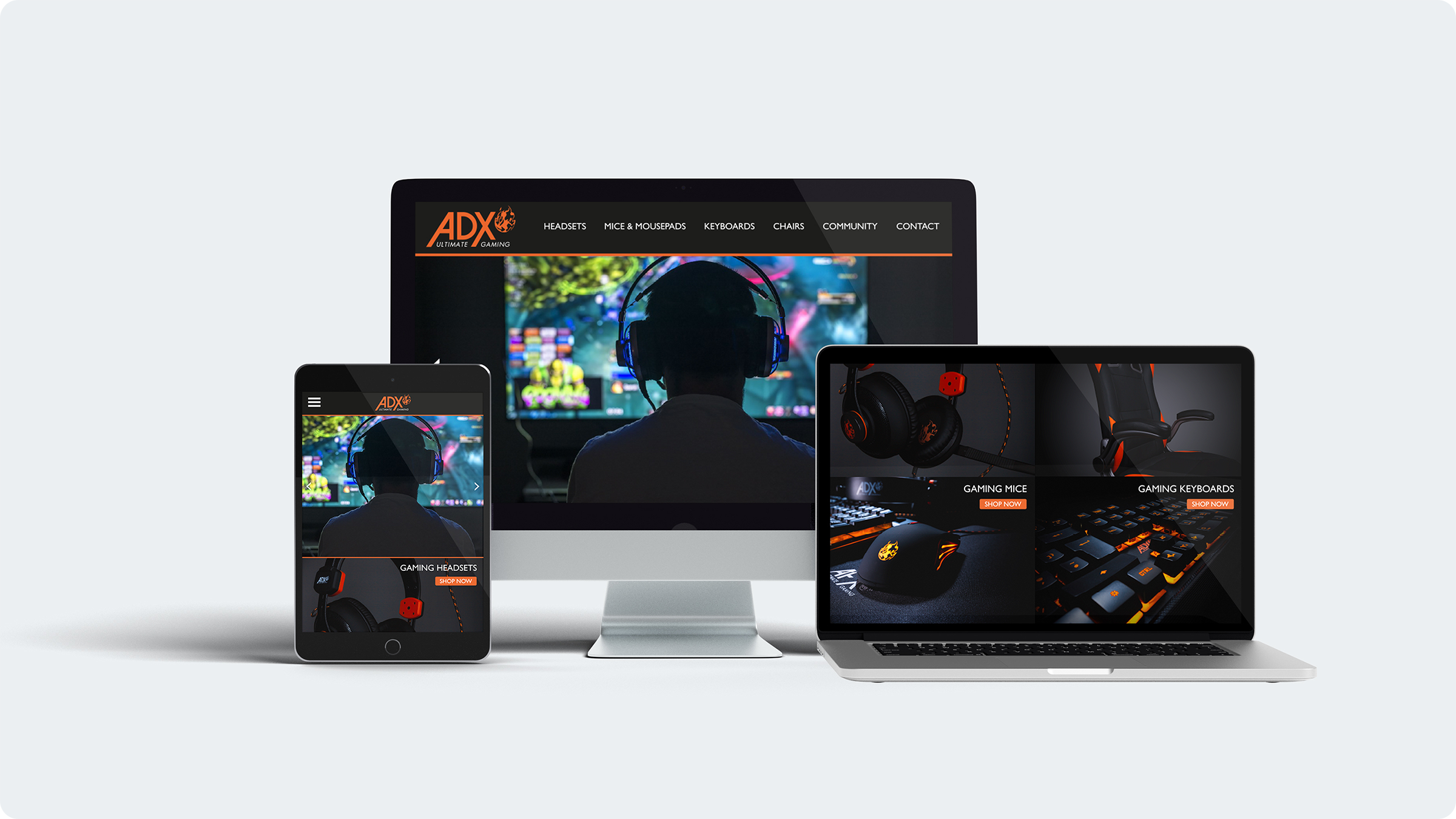
![]()
Previous ADX gaming Look
-
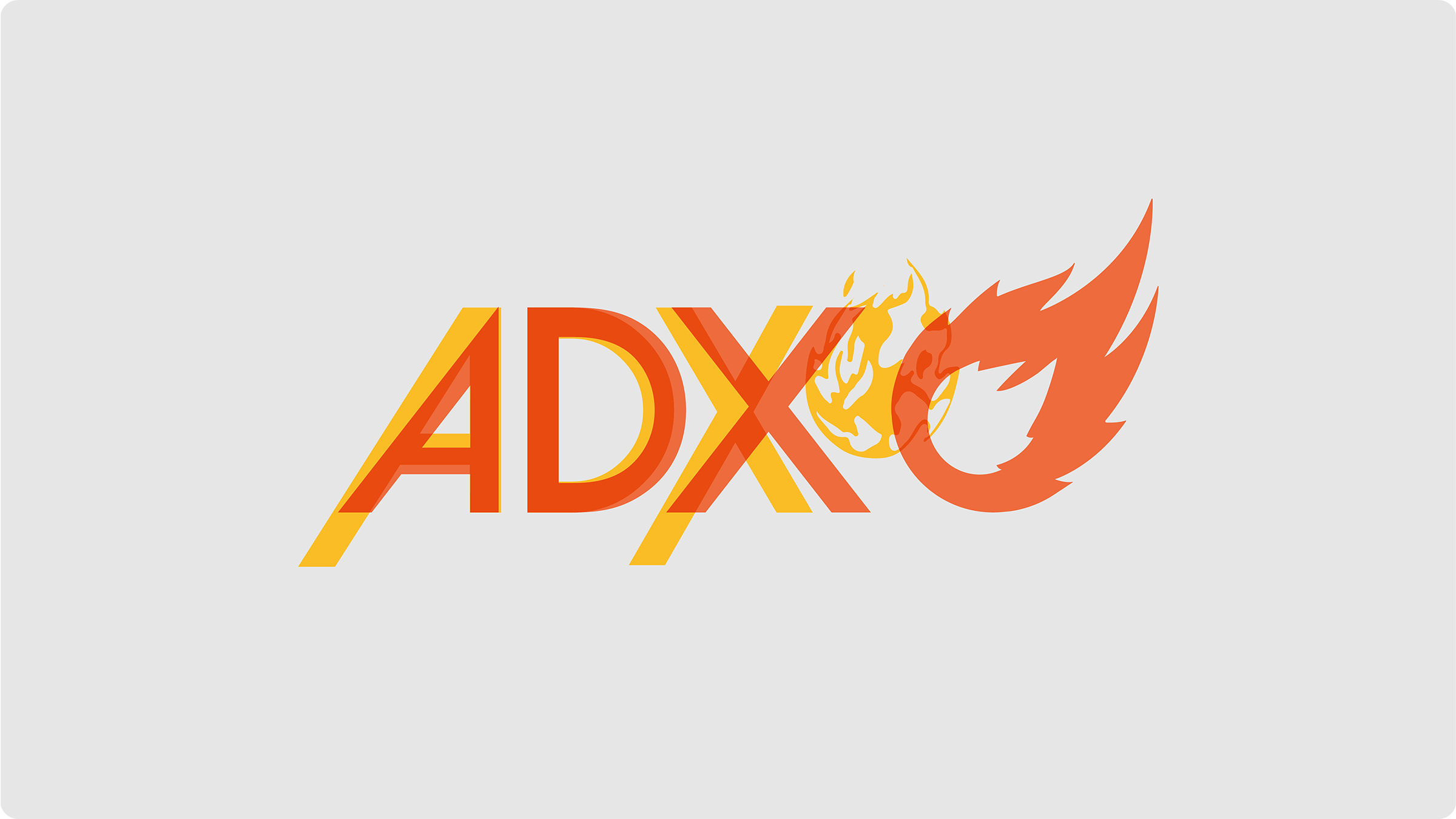
![]()
ADX Logo Comparison
-
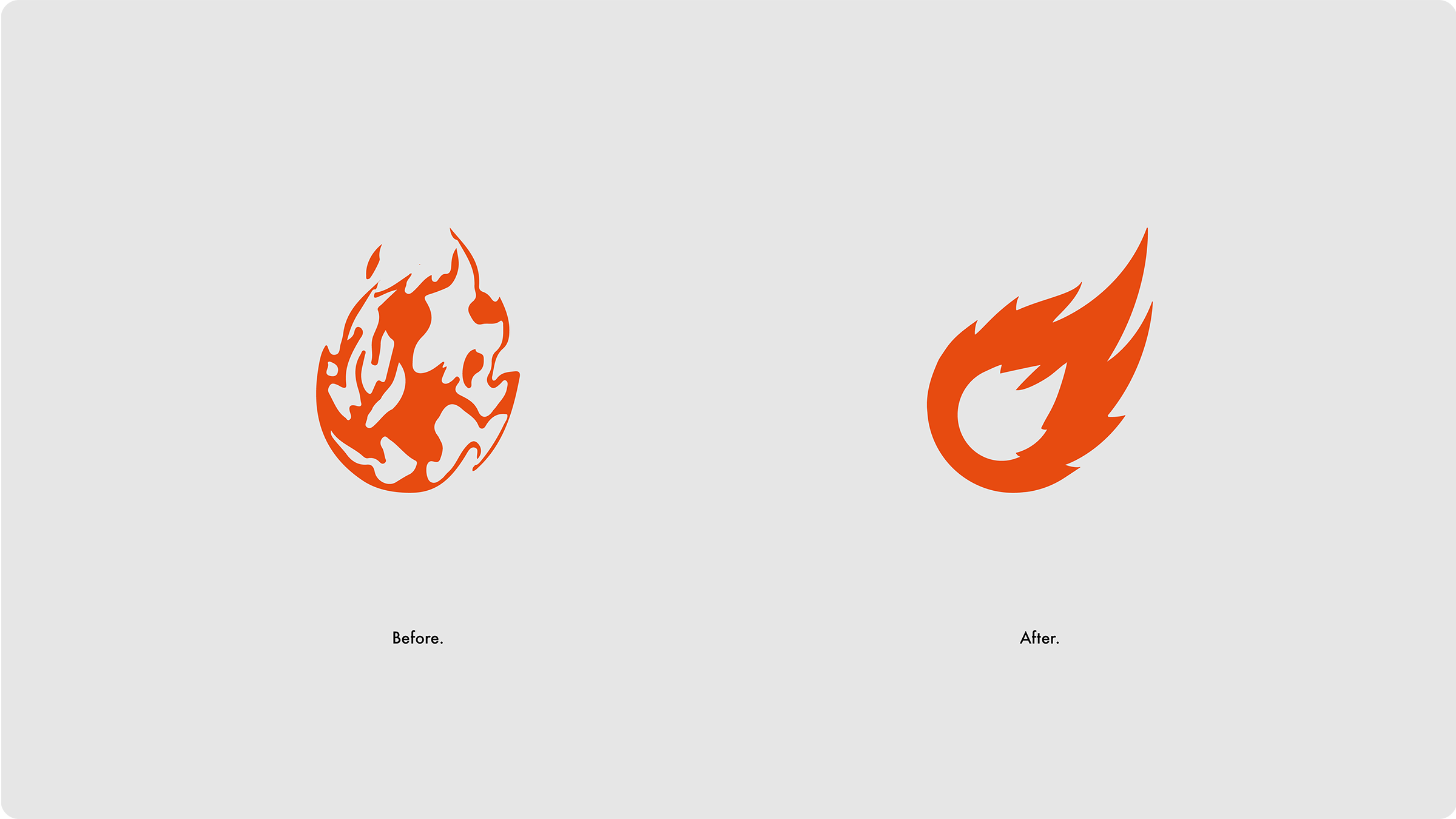
![]()
Before and After.
-
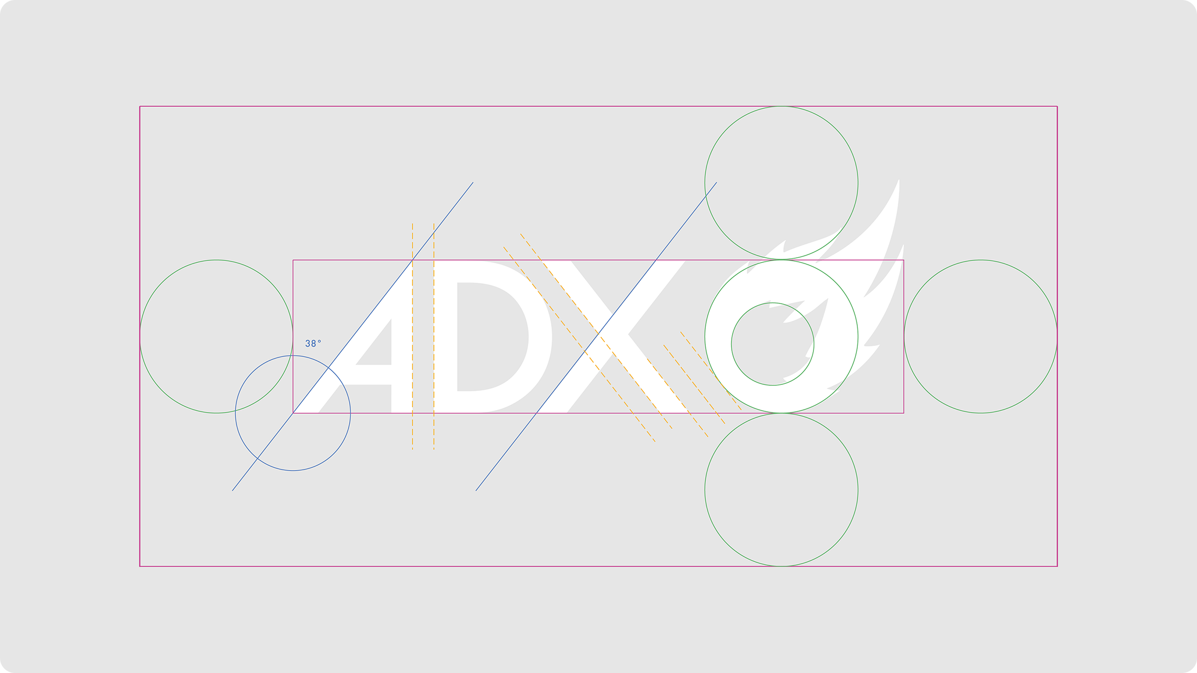
![]()
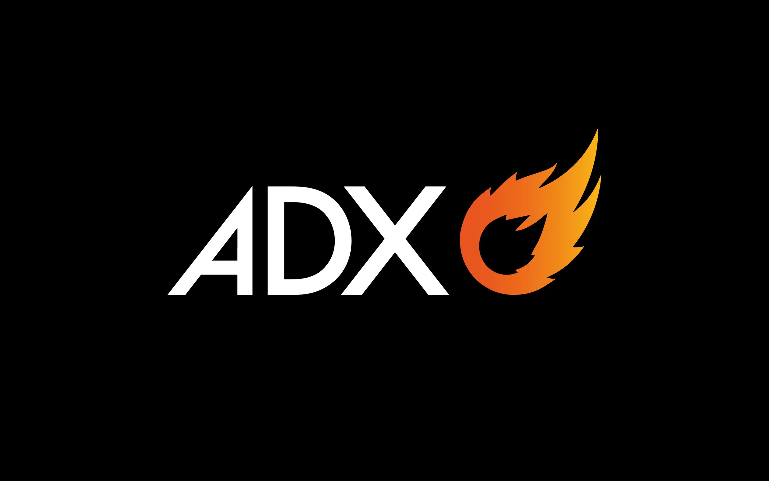
Crafted Logo.
-
![]()
Building the Visual Language
Creative Direction:
Aligned all stakeholders to protect core brand equity while elevating the darker visual direction; making stronger use of the signature orange and flame narrative.
Modernising the logo mark was needed as it was very outdated; refined lettering, improved spacing, and a cleaner, more recognisable flame device.
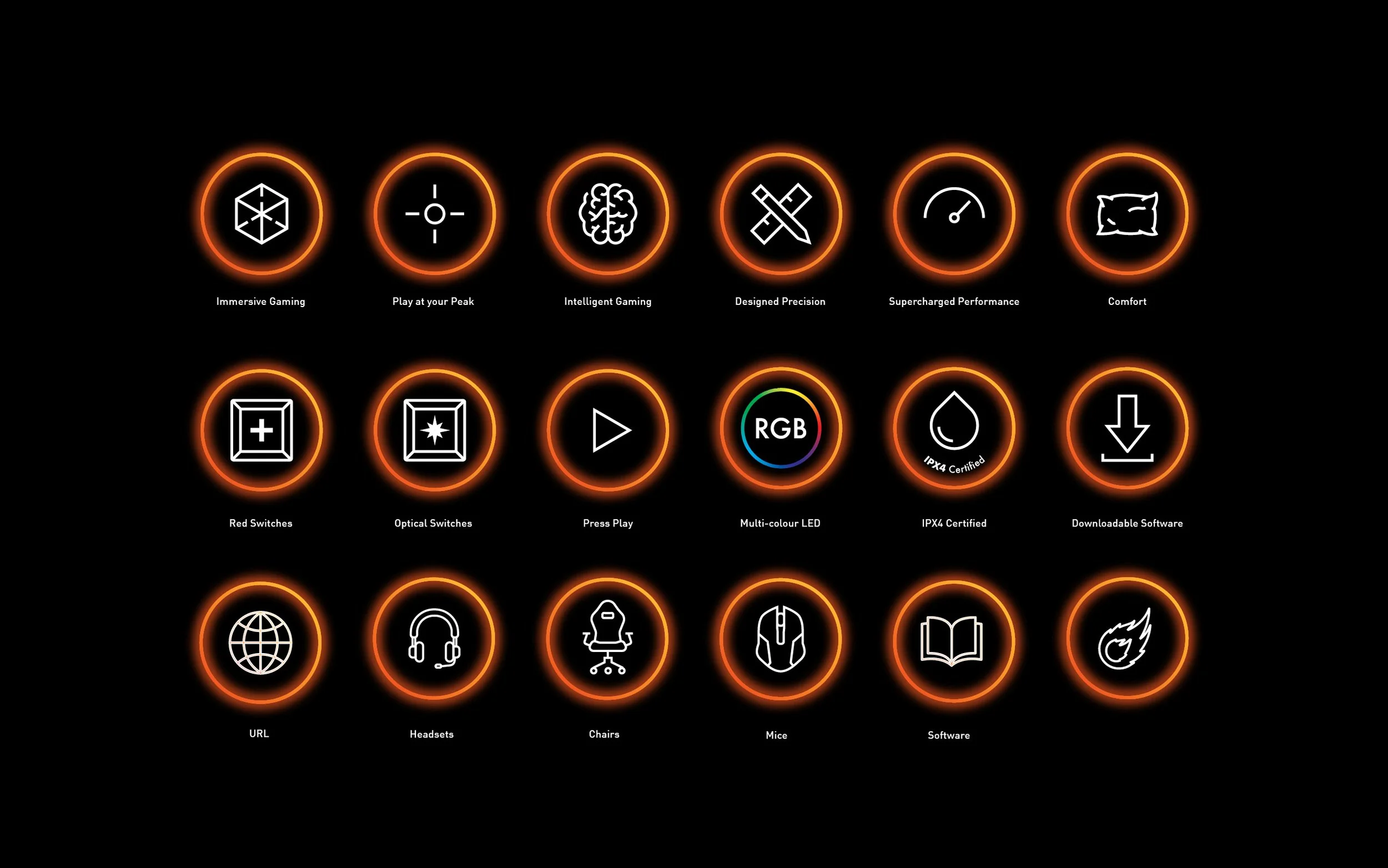
Decision to add more expressive brand elements to inject character, shifting the brand from corporate to confident and distinctive including;
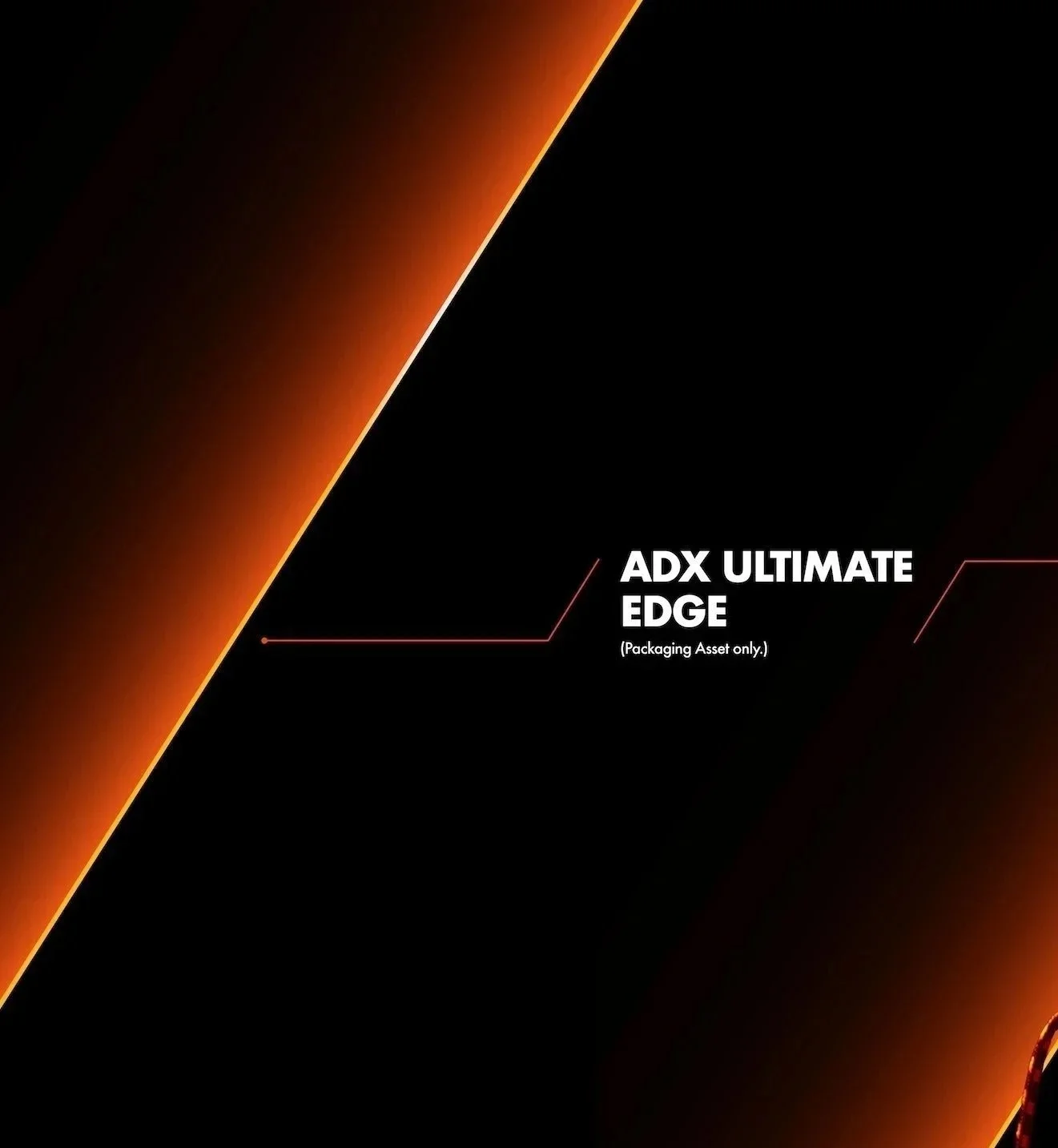
The Ultimate Edge device to hero darker SKUs
An outlined type style derived from the ultimate edge
Introducing new vertical type formatting principles
An enhanced icon system to spotlight product features and propositions
Introduced a new primary display typeface to add modernity and presence, creating clearer synergy with the logo and improving overall system consistency.
Led creative direction in partnership with the internal photography studio