Case Study Type.
Visual Identity/Branding.
Role.
Lead/Senior Creative Designer
Art Director
Collaborated with External Agency, Brand Team, Senior Leadership, Copywriters and Motion Designers.
Case Study Overview.
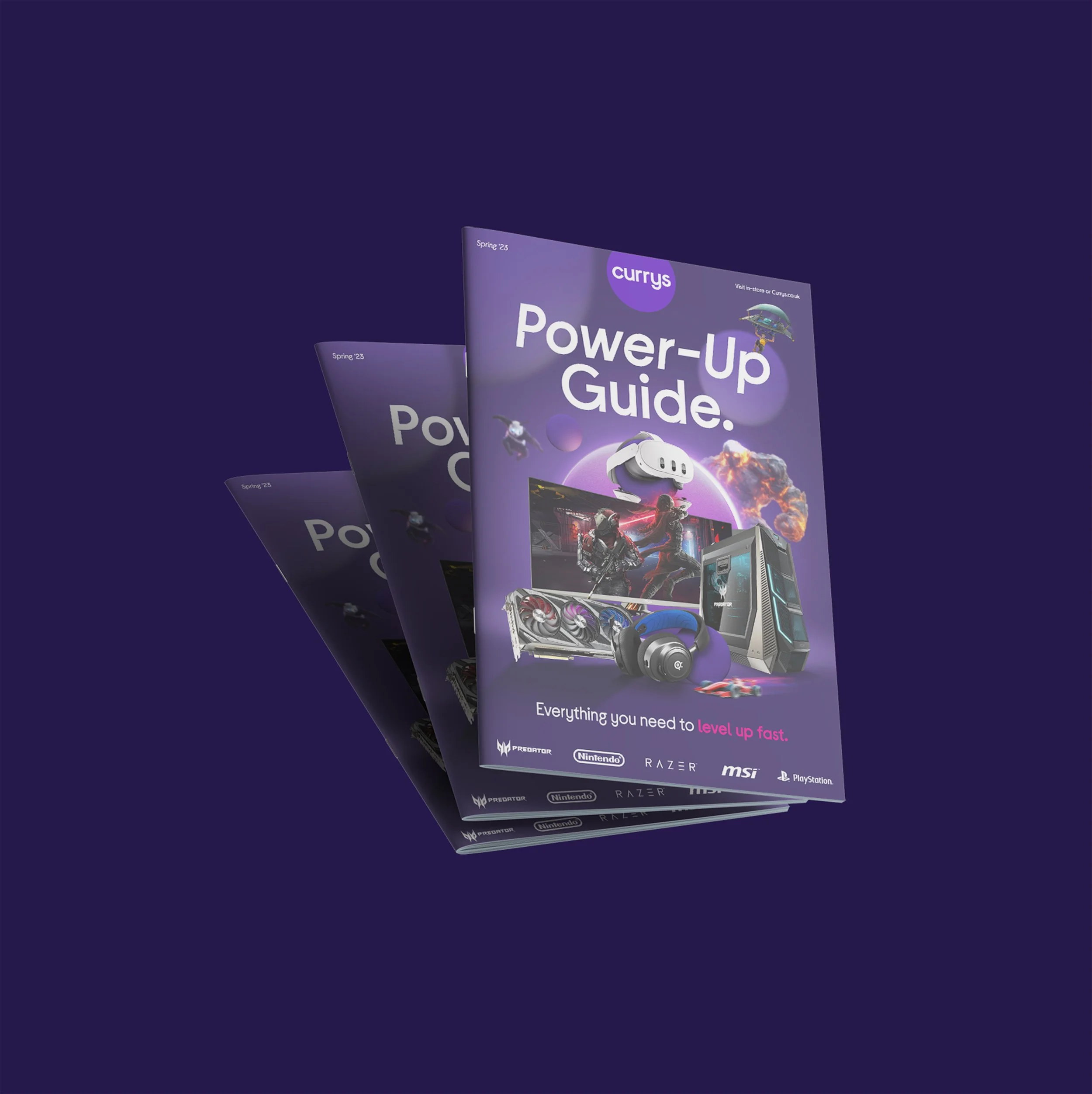
Transform the Currys gaming category to strengthen its credibility and position it as the go-to destination for gaming tech within the Currys brand framework.
Gaming is the largest category in the UK’s home entertainment sector, with revenues that exceed £4.6bn* and it continues to grow rapidly in both audience and technology. The brand currently focuses on the ‘everyday customer’ through its wide tech range. Part of the strategy to achieve trust and gaming share is to reposition itself to better connect with gamers and compete with key rivals whilst still being the Currys.
*Source taken from Currys Annual Report 22/23
Creative Strategy.
-
![]()
The gaming category is NOT a sub-brand.
The strategy is to extend the existing Brightworld identity rather than introduce a new look. Current brand aims at every customers while there is opportunity to target gamers specifically.
-
![]()
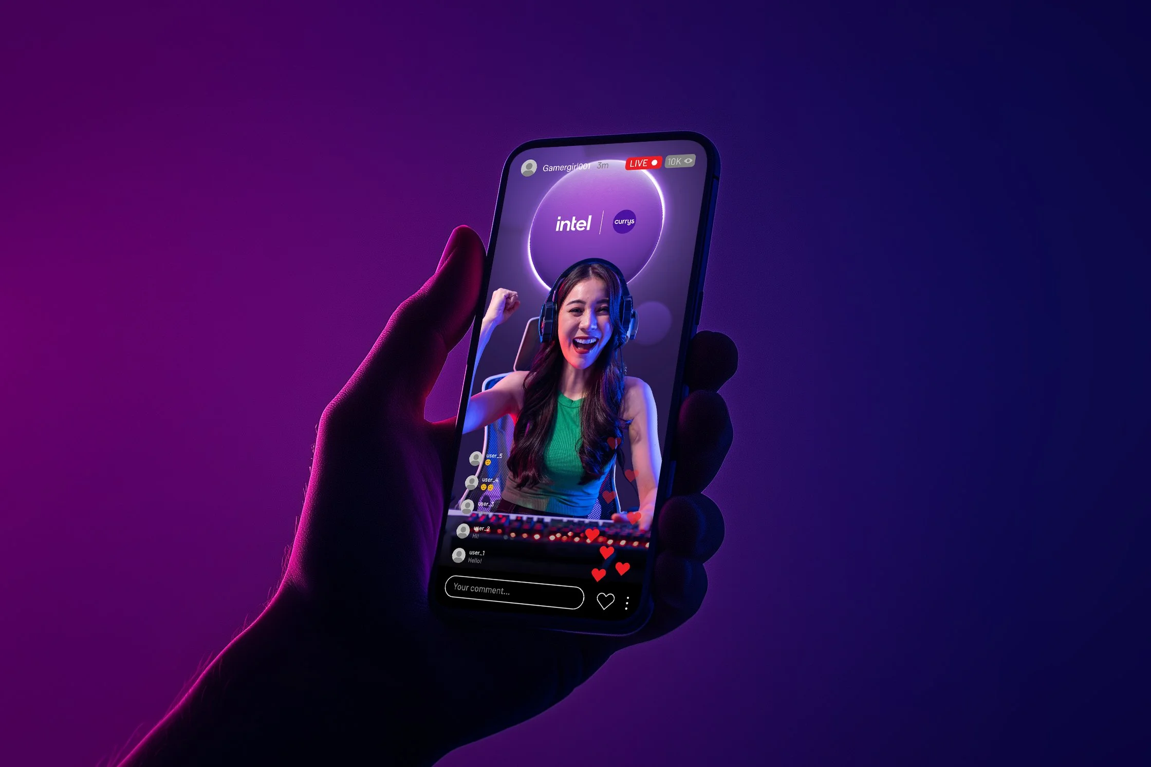
Insight: Gamers prioritise the tech and gaming content.
The approach was to champion these, while ensuring Currys remains recognisable as a credible gaming destination even without them.
-
![]()
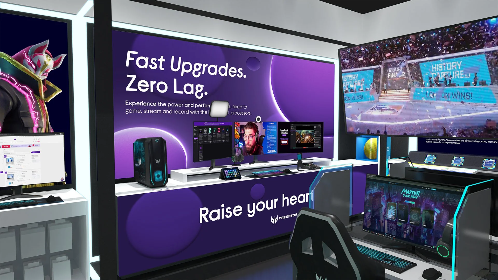
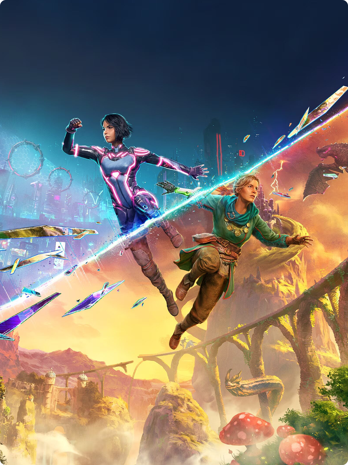
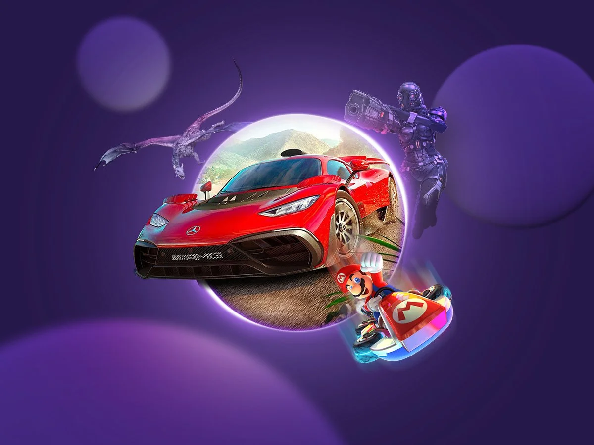
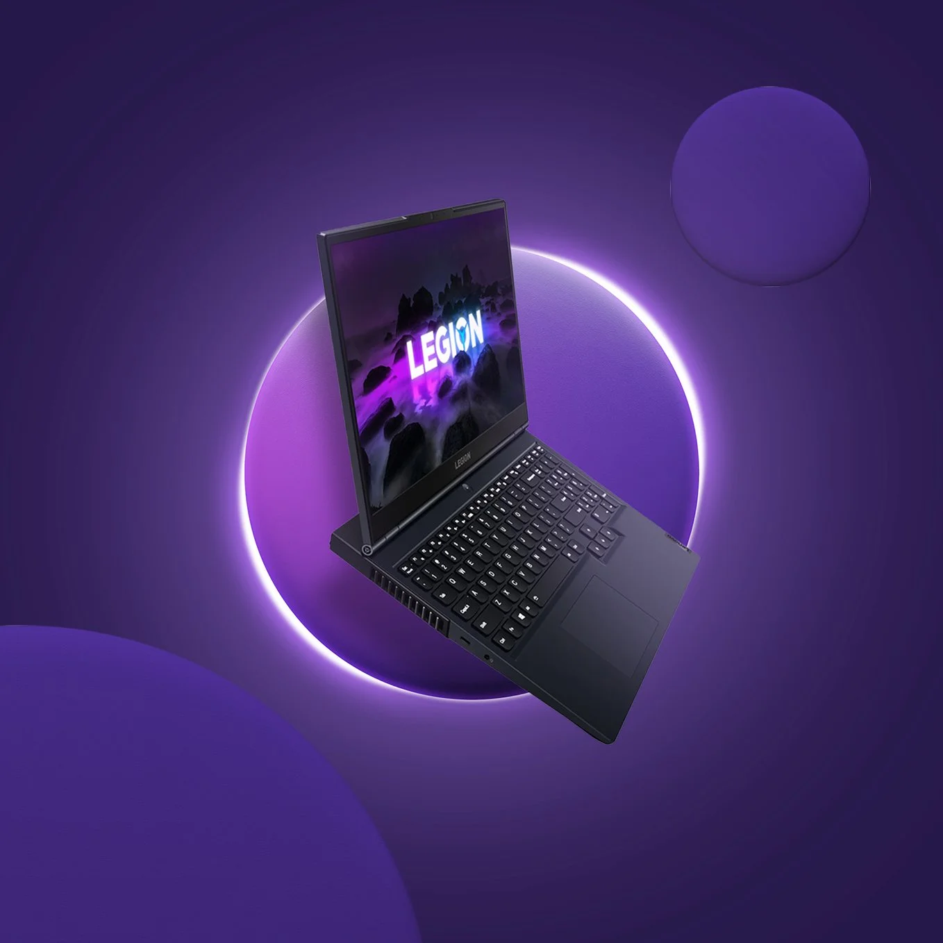
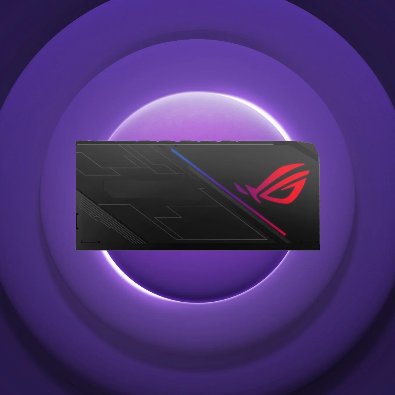
Landscape of gaming.
There’s a clear visual tone; dark environments, vibrant colours against the dark, and bold, expressive assets that feel dynamic and cool.
-
![]()
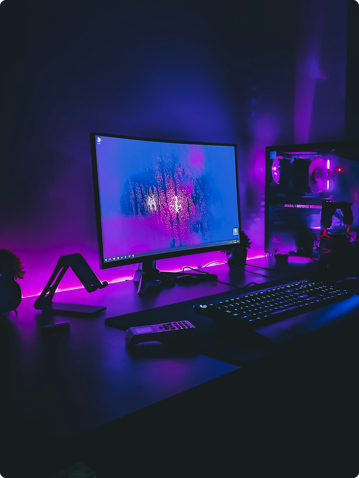
Neon Hues / Dark Mood settings.
Neon lighting is common in gaming setups (especially among hardcore gamers) where dim rooms and vibrant colors enhance gaming experience. -
![]()
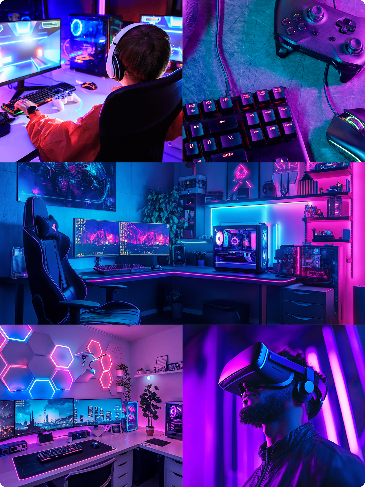
Visual Direction.
An immersive gaming aesthetic incorporating neon hues and darker settings – Cooler, more playful but also professional yet serious about gaming.


Creative Idea & Narrative:
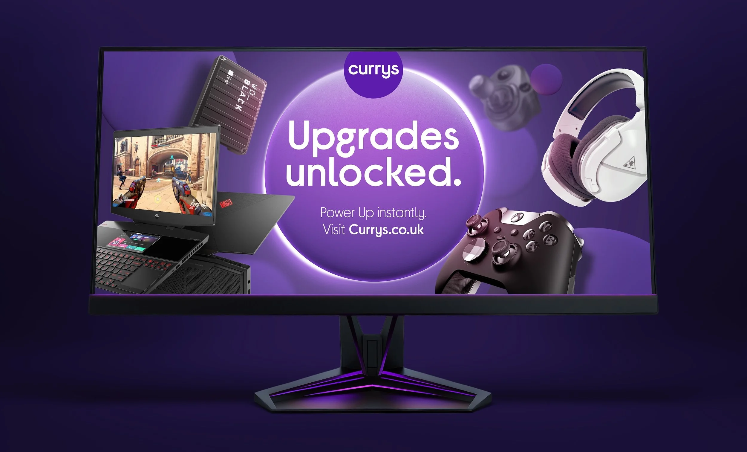
We introduced and created the Halo hero asset. A glowing light backlit behind the Currys brand circle inspired by the iconic moment of a console/PC powering on – a distinctive visual device to anchor the gaming identity and something almost all gamers recognisably do before playing.
The Halo was also designed as a functional brand asset: unifying gaming content, naturally spotlighting darker products, and creating contrast within the darker setting, while ensuring consistency within the Currys Brand framework.
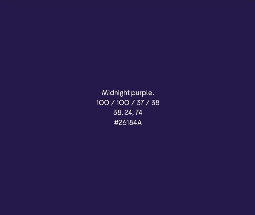
We introduced a dedicated colour palette for the gaming category (additional to the brand) influenced by the Currys core brand purple and turning ‘bright world’ into ‘dark world’ – a language that is visually common throughout the industry.
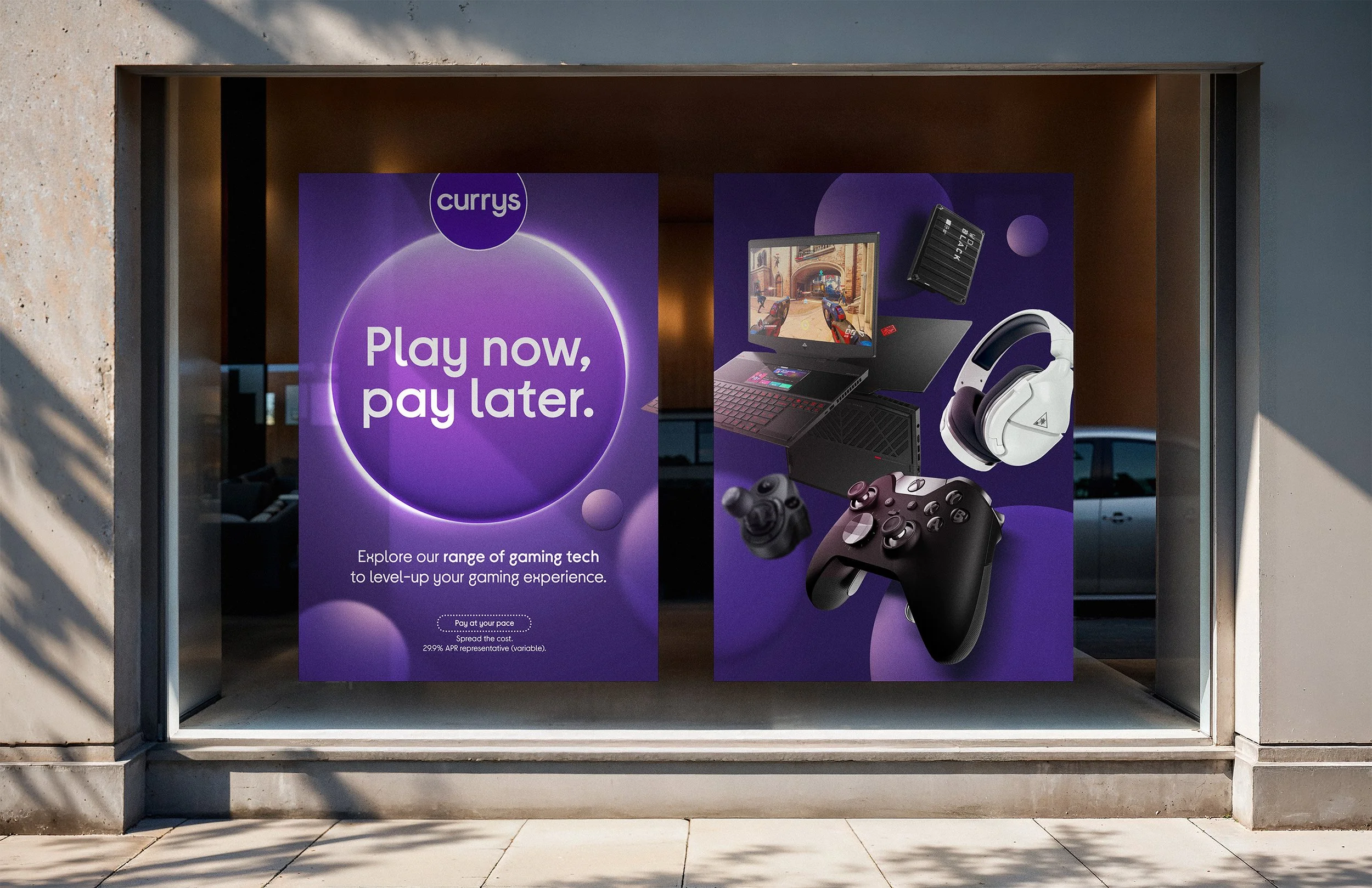
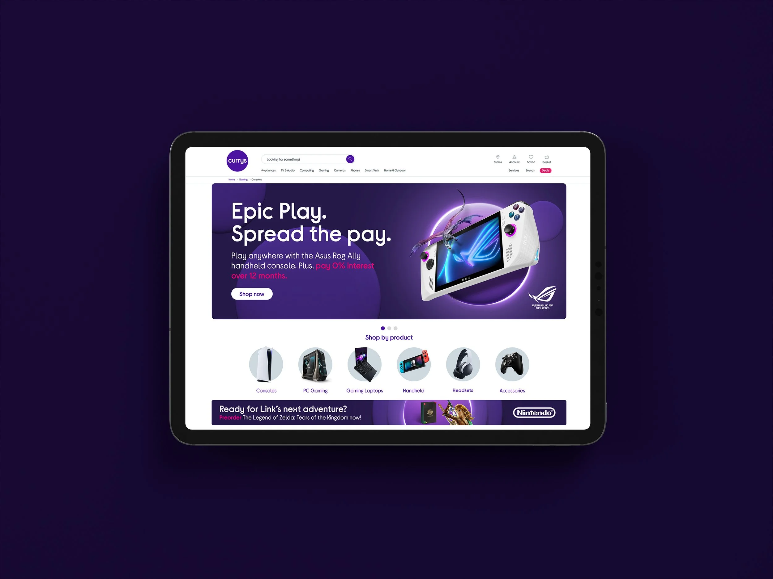
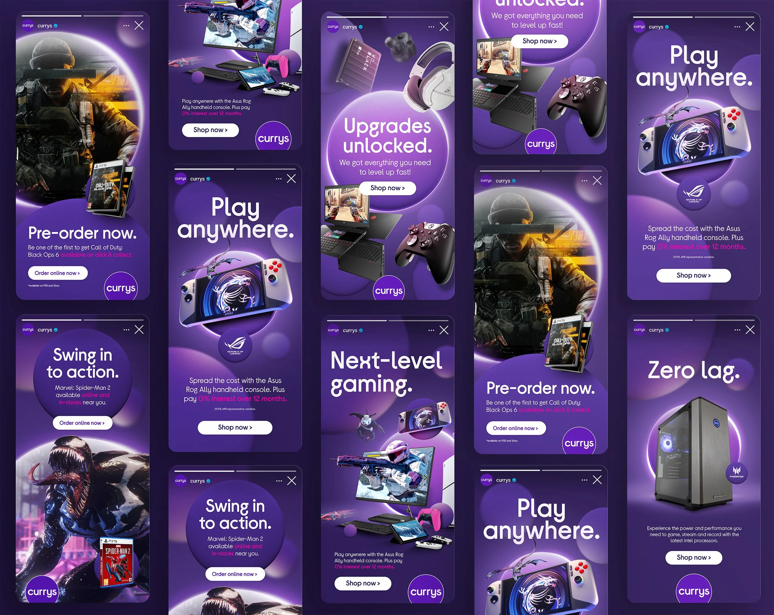


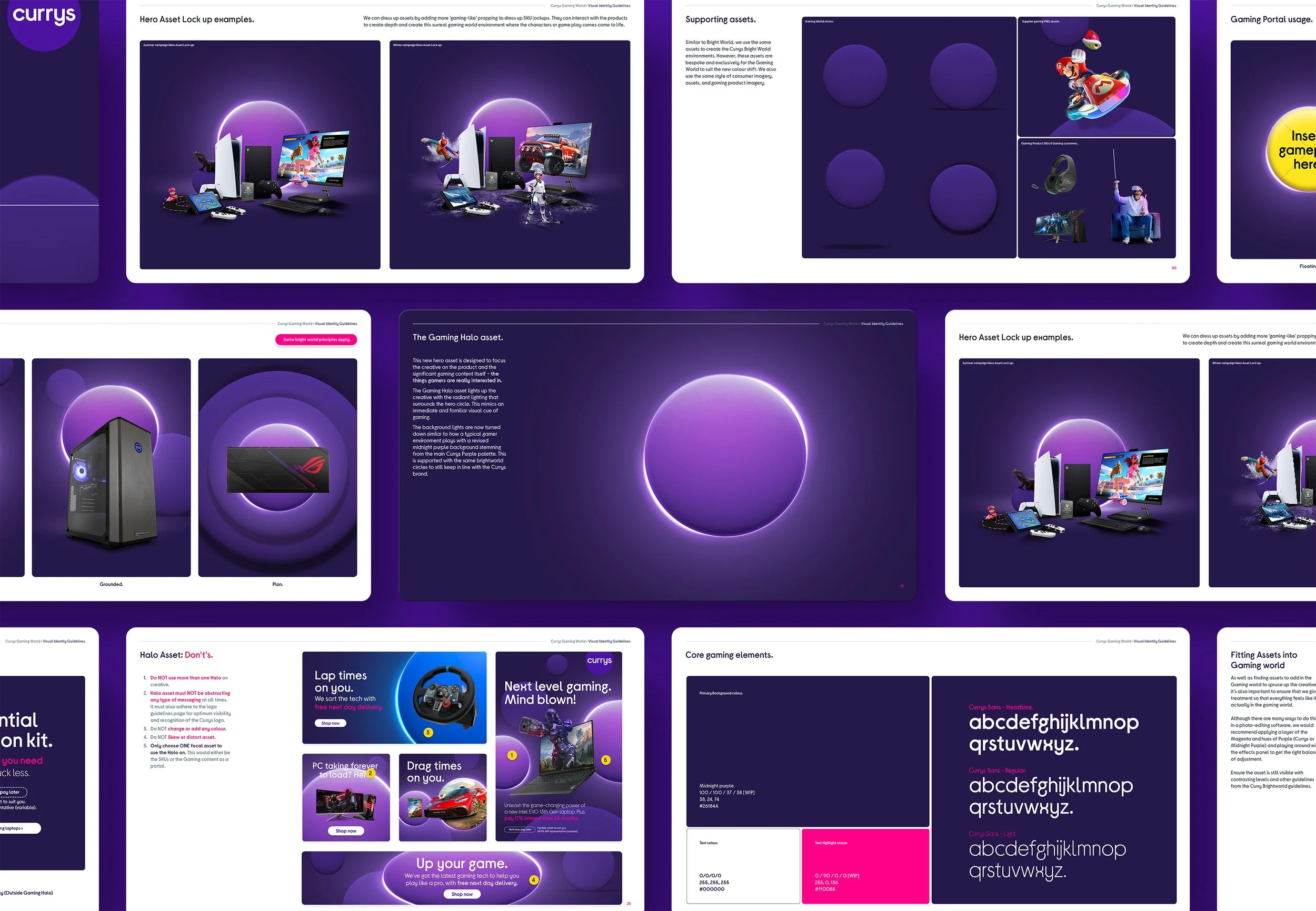
We crafted a visual identity rooted in gaming culture that targets all levels of gamers better whilst still maintaining the Currys core brand identity (and without giving it a complete new look). Because of this strategy, it’s created uniqueness with a lot more ‘impact’ and more creative freedom for the business to communicate to gamers.
Collabs.
Currys Brand Team
Stefano Martin - Motion Designer
Senior Leadership (Creative)
Outcomes.
Expanded brand flexibility through a richer gaming asset system backed by insight, enabling clearer product storytelling and more effective upsell opportunities.
Increased supplier confidence through marketing campaigns and Social and Gaming squads, driving greater funding and deeper collaboration in promoting products within the Currys brand ecosystem.
Contributed to significant market growth, supporting a +65% increase in UK (as of 25/26 since 23/24) following the rebrand.